

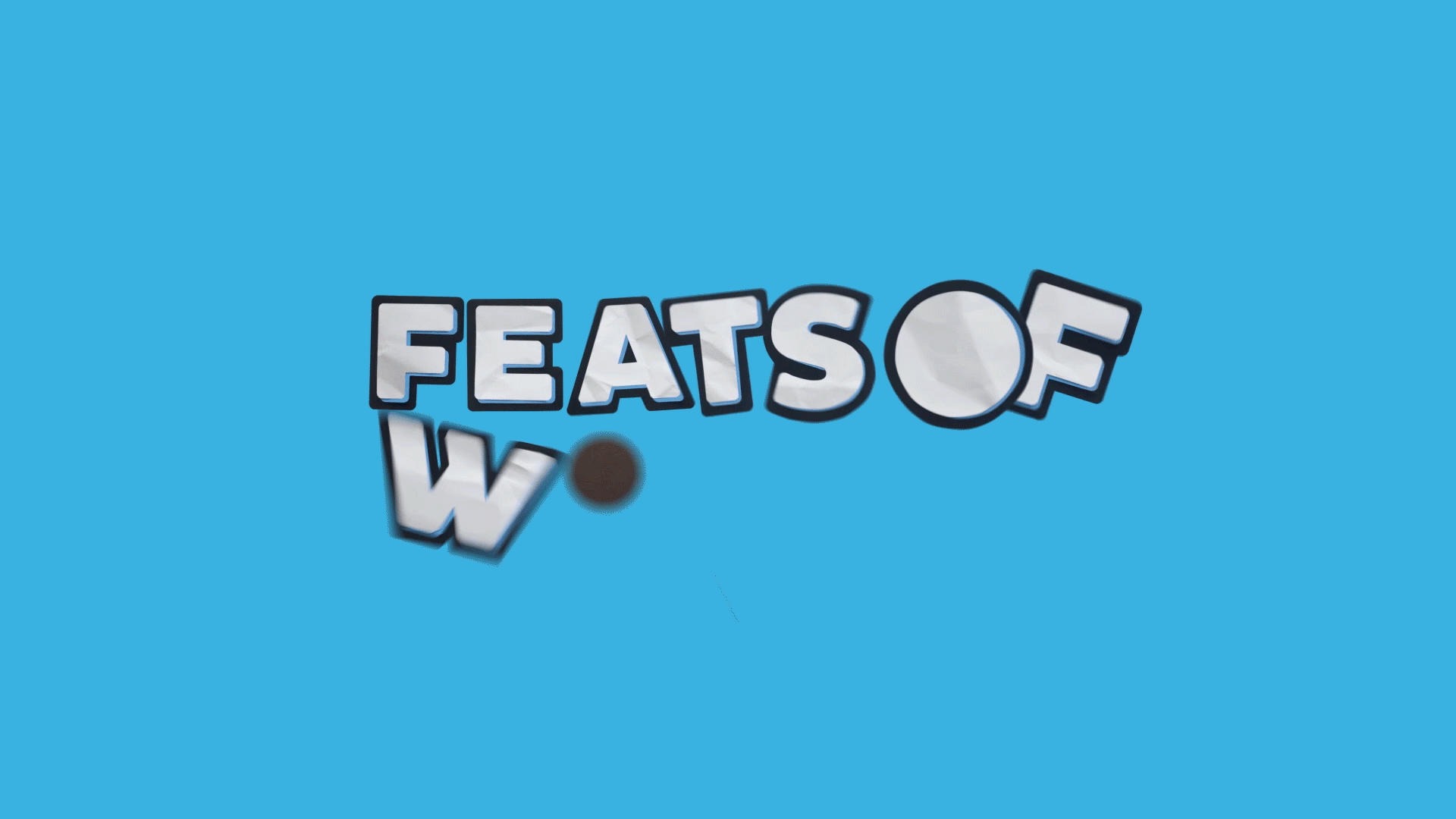
Oreo | Paper Type Logo & Font Design
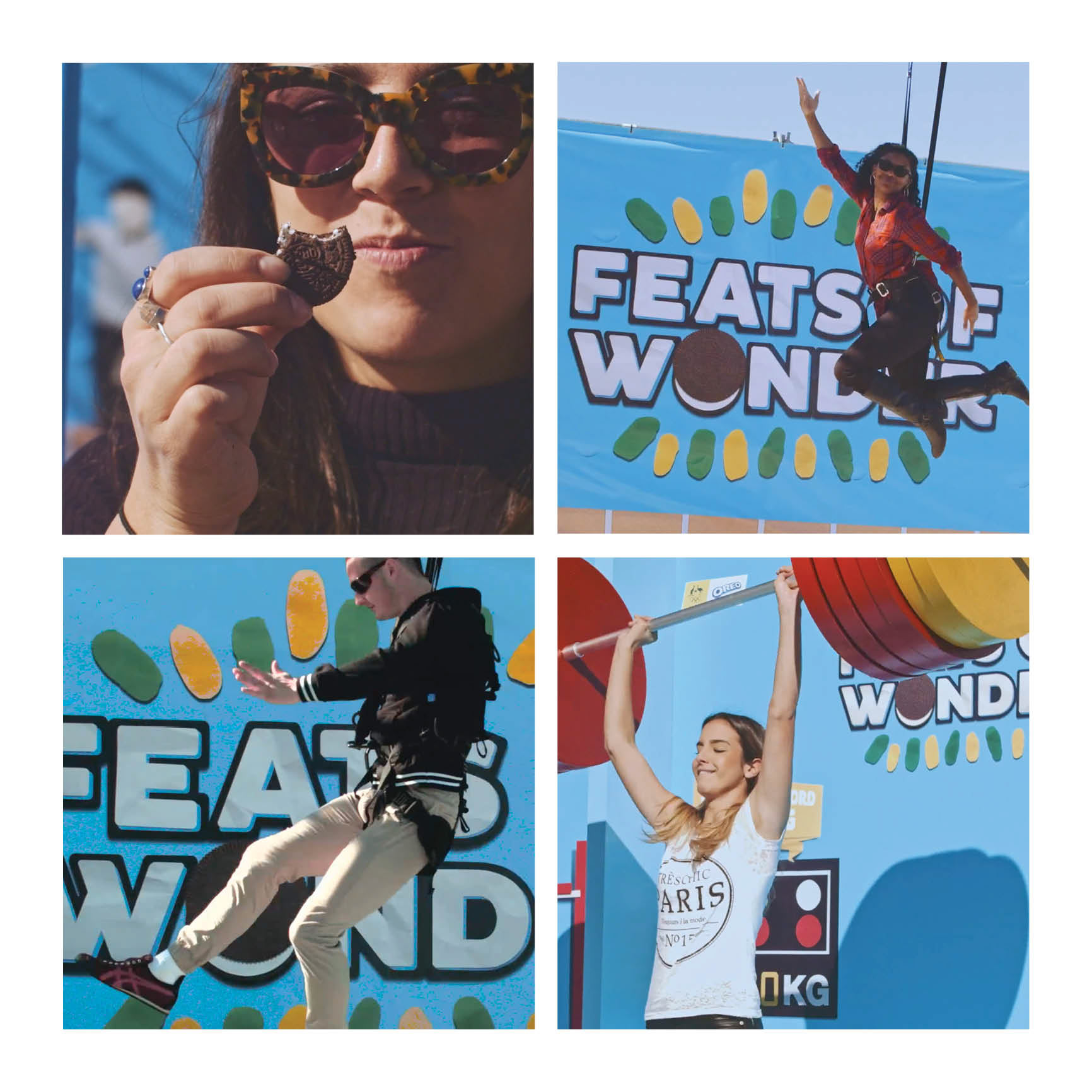
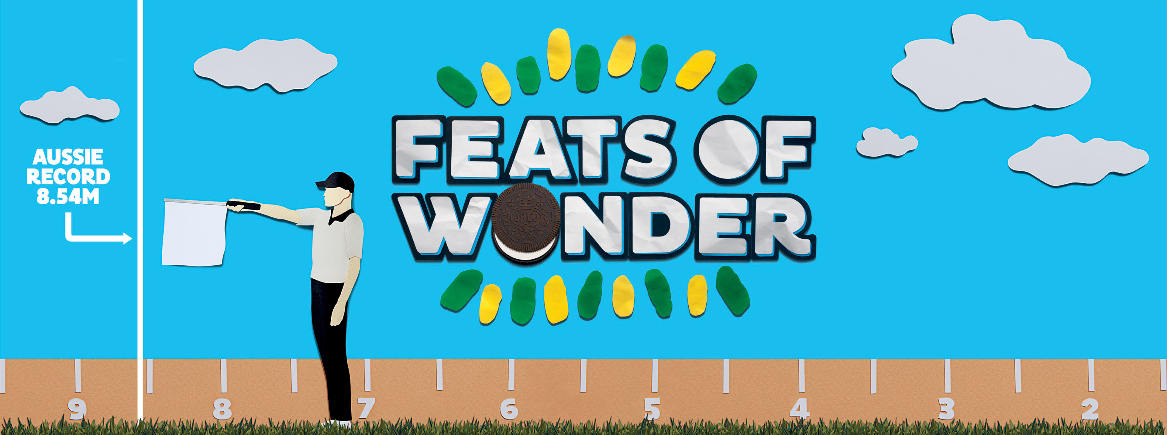
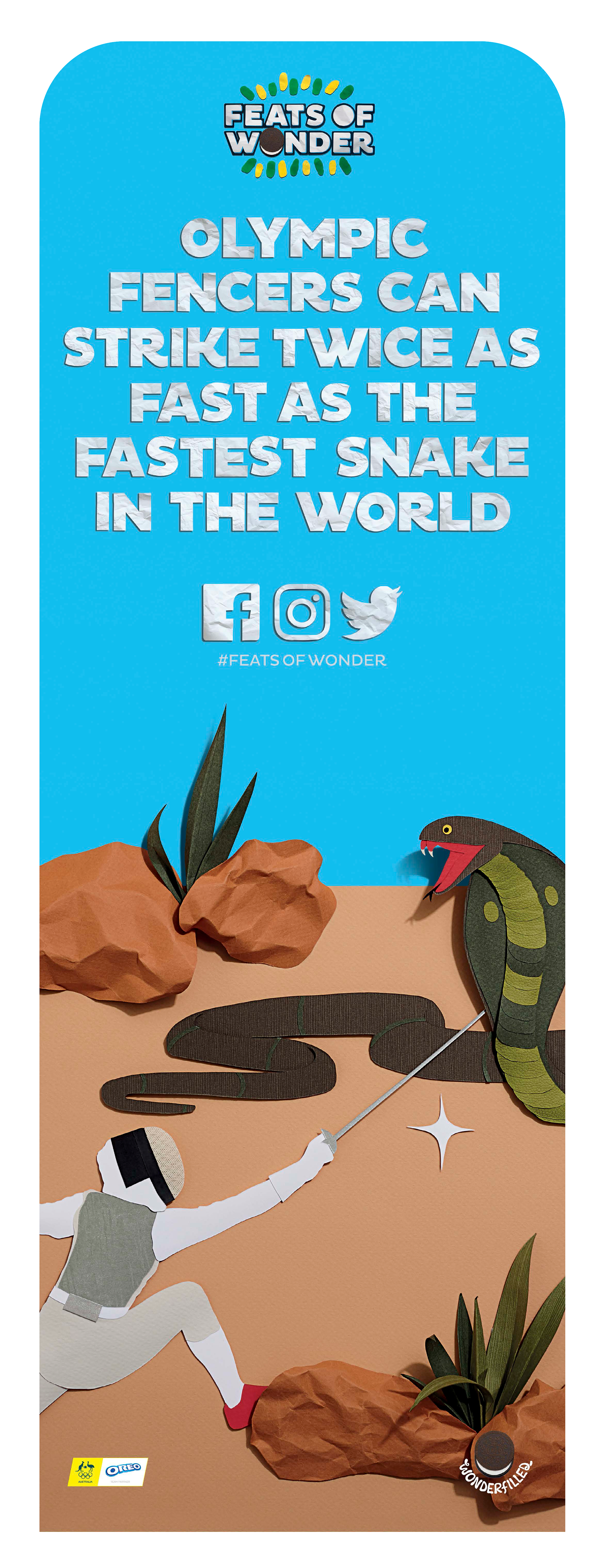
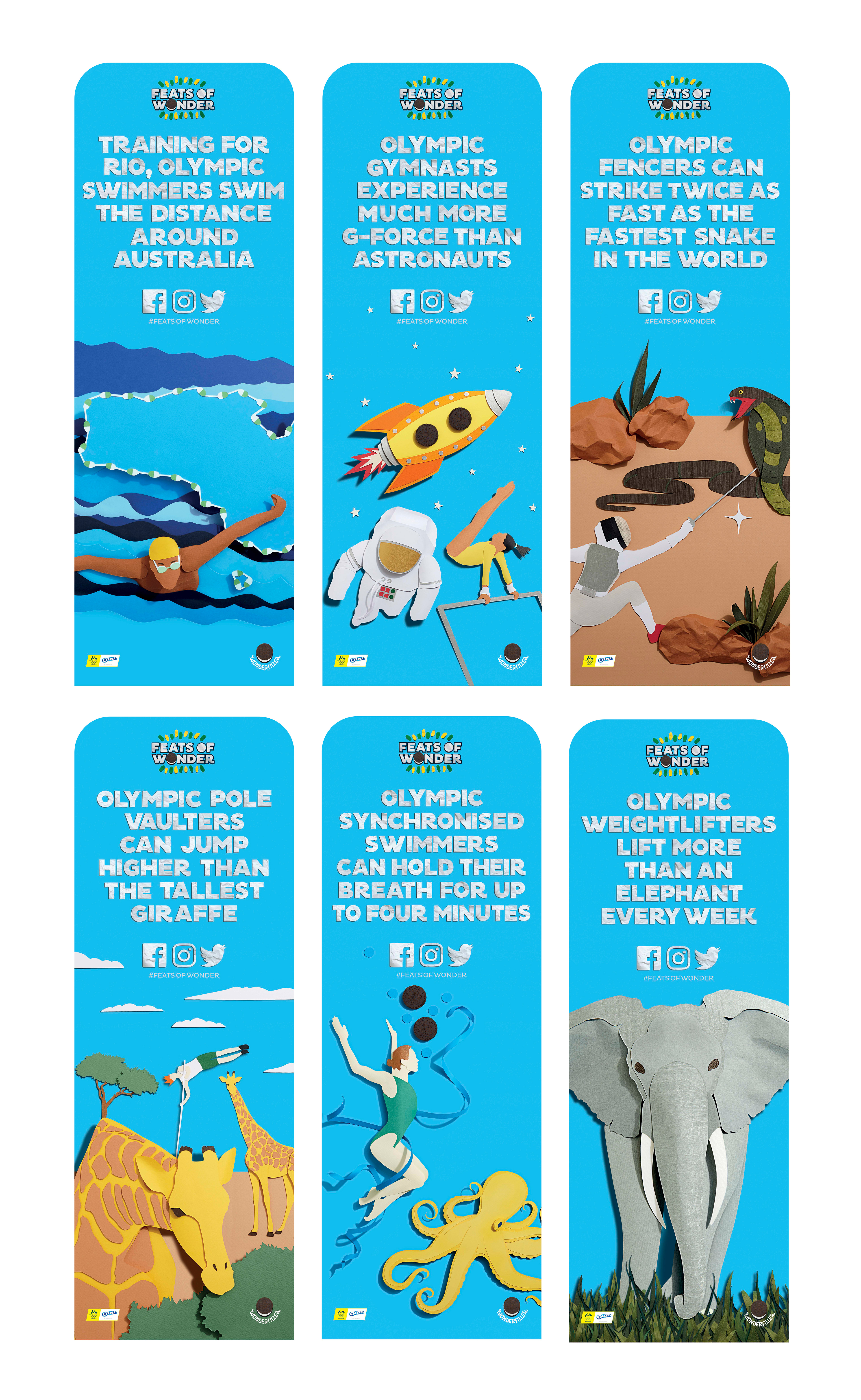
For two days, Oreo ‘Feats of Wonder’ set up on the Sydney shores to celebrate its partnership with The Australian Olympic team. Oreo gave the Australian public the chance to experience the amazing things our athletes achieve, with an Oreo twist.
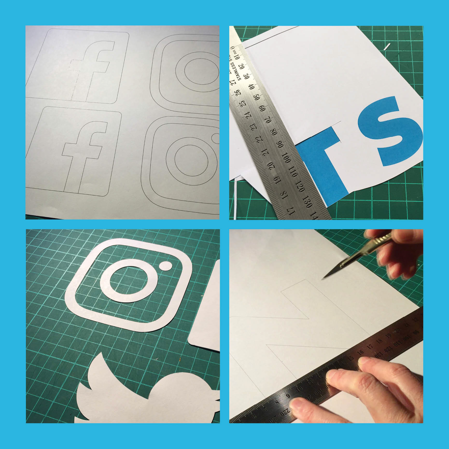
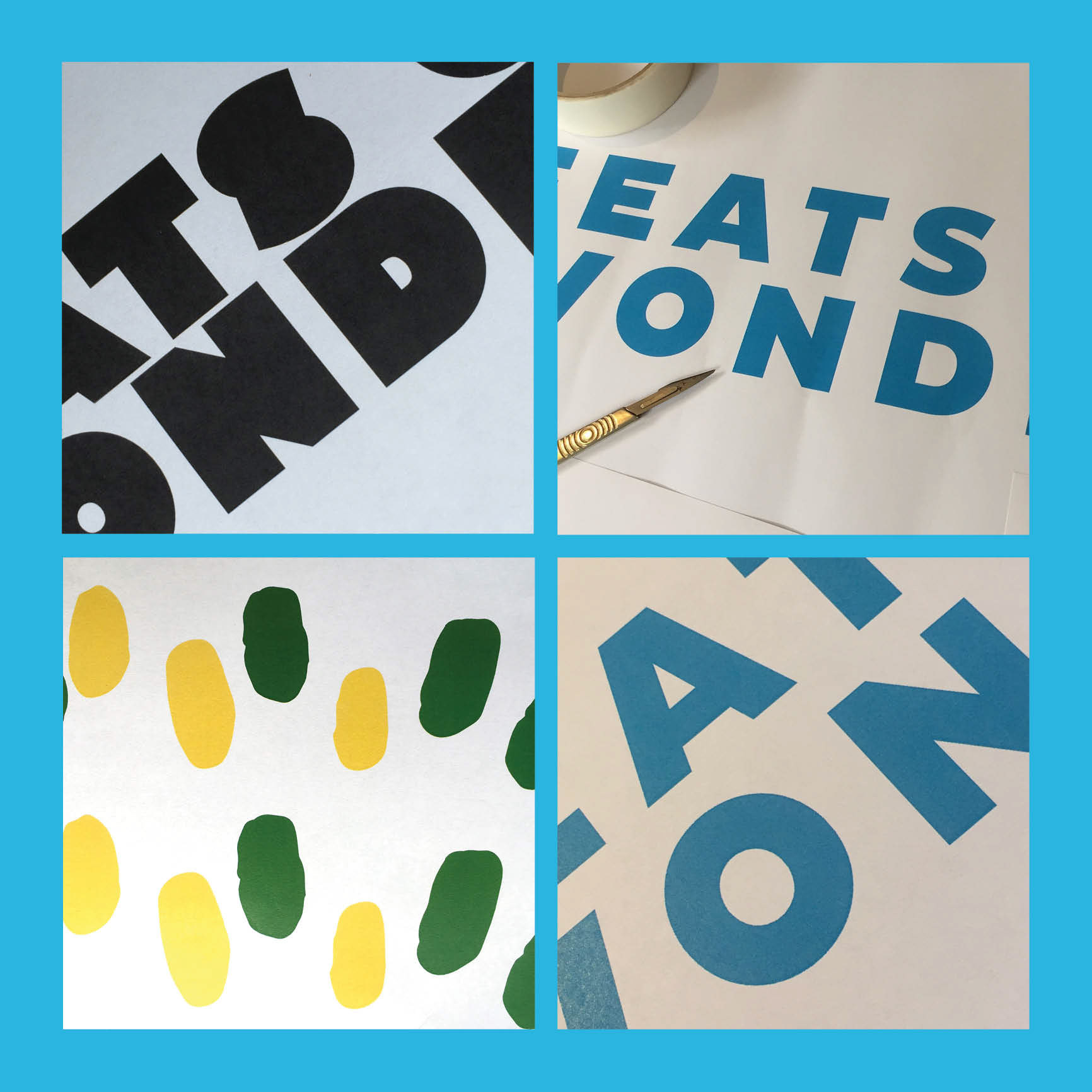
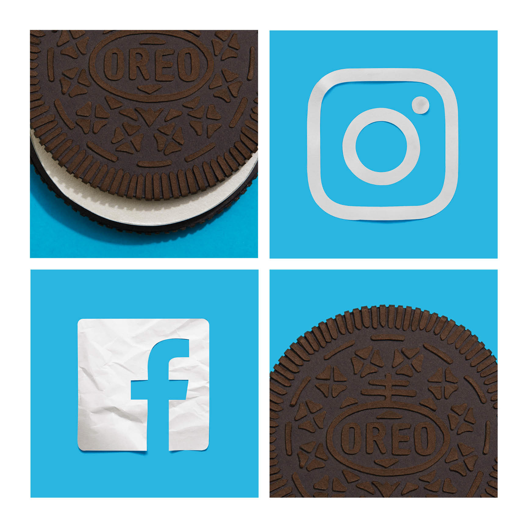
My work involved designing the logo and a full font alphabet suite in hand cut layers of paper. Next was photographing the elements and refining in Photoshop. The design has three layers of colour and the lettering has three different versions of each characters and social media icons.


Client: Sapient Nitro
Type Creation and Design: Marcus Byrne
Art Director: Chris Shoolman
Paper Illustrations: Benja Harney
Copywriter: It's Phon
Type Creation and Design: Marcus Byrne
Art Director: Chris Shoolman
Paper Illustrations: Benja Harney
Copywriter: It's Phon